THE USE OF COLOUR:
Colour is used in lots of children's projects because it gained their attention and interest. Colour can also change how a person feels in a space. In the case of this building I have used colours such as yellow greens and blues for the upper levels because i want this area to be calm and serene and also help the children concentrate. In the social areas there are colour such as red, purples and pinks because they encourage movement and activity. Yellow has been used the most in this project because it is a happy colour and can be used in both calm and active spaces.
THE USE OF THE TREE:
The tree provides a few good things in this project. It starts below ground level which lets light into the space below. The foliage create shade in the courtyard as well as providing interesting shadows on the rigid building. Also it provides a central focus for the building emphasising centrality of the project. Furthermore the use of the tree fits in well with the site context as there are trees in all parts of the site.
DRAWINGS:
 |
| Elevation From River |
 |
| Elevation from Entrance With the elevations i had wanted to show shading of the different levels of the building. This would have helped to create more depth in the drawing. Also I wanted to put context in the background... Unfortunately I just ran out of time. |
 |
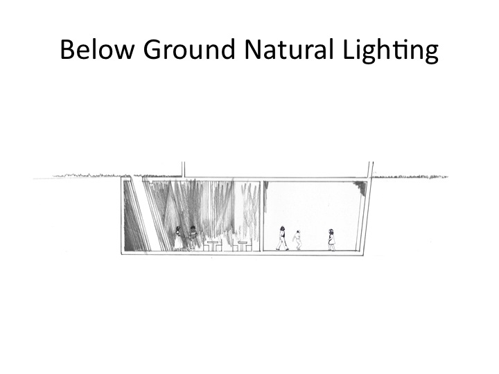
| Below Ground - Floor plan In this level there are mostly activities based on technology such as computer use and audio. There is a hire station for laptops for the children as well as computer desks. There are rooms for audio listening and visuals projected onto the walls these are relaxing spaces. There is also one room designated for interactive learning where movement changes the audio and colours of the room. Additionally there is storage space for the library. To create lighting in the underground level there is a light source from the centre outwards from the upper level. There is glass surrounding the best of the tree which is inset about 1.5 metres below ground level, that allows the viewer glimpses up into the levels above and also natural light into the space. There are also other glass parts of the ceiling which again allow for light into the space and views of the upper storeys. |
 |
| Ground Level Floor Plan The level is the entry level |
 |
| Above Ground Floor Plan This level is a quiet reading and reflecting level. There is a library area for collection of books. and there is both small scale individual spaces for reading and larger areas for group reading such as for the younger children who have group reading time. There is also green space between each building that has two purposes. One is that it provides views out to specific contextual elements such as the cliff face. down the river along kangaroo point and also out towards the city. The other purpose is that it provides a break from the silence of the the reading areas and can used as social areas. |
 |
| Roof Plan. The is the roof plan of the building. There are perforations in the ceiling to allow for light to stream into the interior especially for the upper level because this area is a library, reading and studying area. |
 |
| Window diagram - This diagram shows how the lighting and views work with the windows. Windows of a large size are placed on the interior of the building facing the courtyard and there are smaller perforations in the sides of the building to allow for light to stream in. This is so that the focus is into the centre of the building. |
 |
| The Hero shot - perspective from the bridge near kangaroo point |
 |
| Perspective of Ground Floor area with play areas for children. |
 |
| Perspective of below ground level large sound and visual room. This is relaxed space for children to take in what they are listening to or watching. |
 |
| Perspective of wave floor area in group setting in the Ground floor level. There are flat areas available for easier group gatherings and also are cozy because they are circular . |
 |
| Perspective of above ground level individual reading areas. As it can be seen different size occupants can go into different areas. A teen occupies the larger scale space and a smaller child uses the smaller space. |
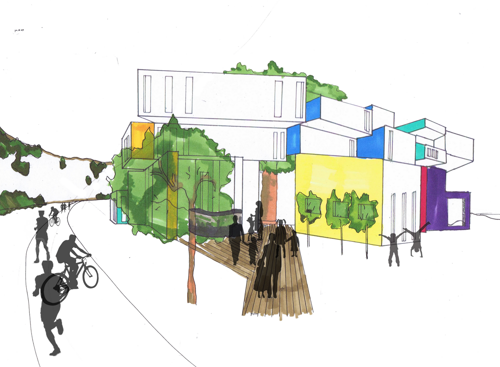 |
| Perspective of the approach to the entrance. |
 |
| Perspective of green space on Above Ground level. In this area people can relax and chat or play. |
 |
| Diagram of Building spaces. The top level is a quiet zone mainly for reading, studying and reflecting. The ground level and entrance level is a bustling busy social level and the below ground level has a mixture of quiet areas and active social spaces. |
 |
| Section 1. This main section cuts through the main play areas of the building. |
 |
| Section 2 |
 |
| Section 3 |
 |
| Site Section. The size of my building fits in well with this site because it does not impose on the site too much. It is only two levels high sinze the third level is underground. This is so that the building does not feel like it is overarching patrons in the courtyard. |
 |
| Site plan. |
 |
| Site Diagram. This diagram shows how the building works in terms of access around and to and from the building . Additionally it also shows the views from the building. |
POSTER:

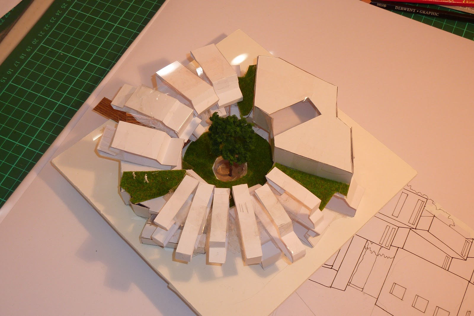
MODEL:

PLAN FOR PRESENTATION:
*PROCESS*
Folie was based on the river and is constant movement. It is
an internal experience . centralised.
Folie to Building:
The brief maintained that a learning centre for the ages 6 –
18 was to be created in the same
site the HWS. In analysis of the site I could see that the spot where the folie
ahad been placed was the best possible option for a buildning, due to the
sunpath, shadows and views to and from the building; Also this location is a
turning point for pedestrians that access the HSW when
running or cycling or just walking. I endeavoured to create a building that
harnessed this aspect of the site and acted as a ‘joint’ in the site providing
opportunities of exploration for the pedestrian.
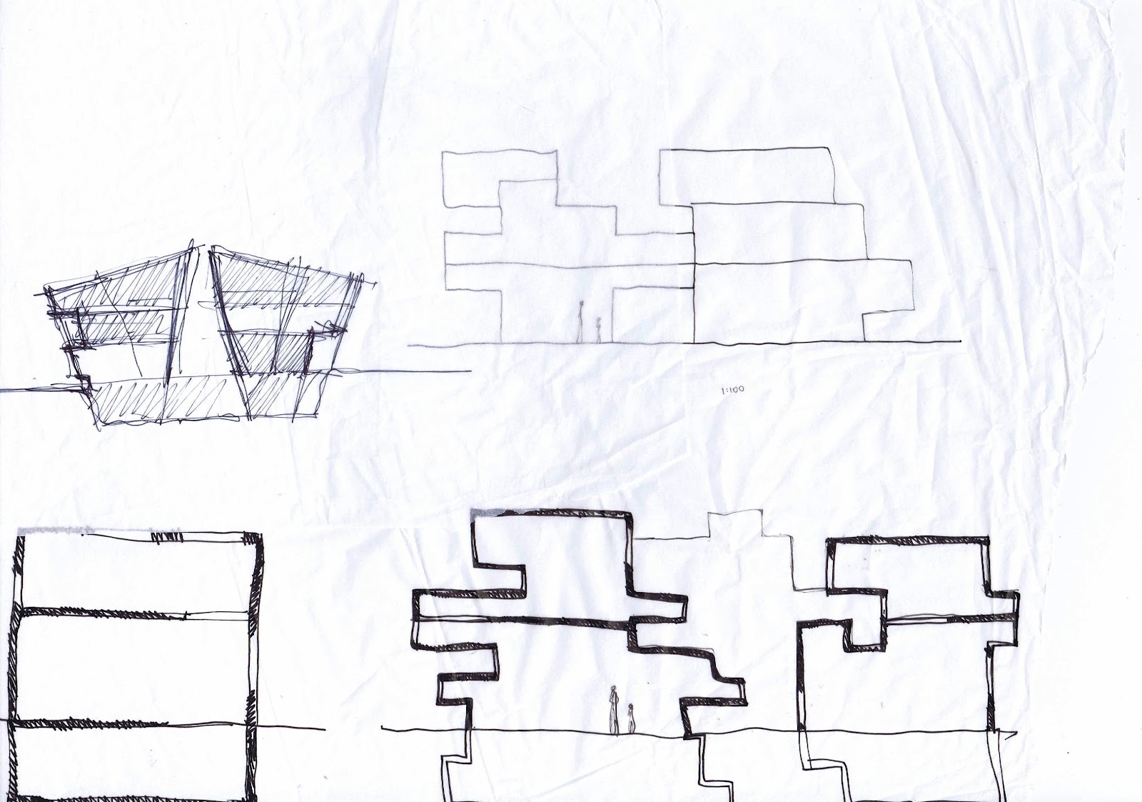
In this phase development I was looking into splitting up
the age groups via spaces into 3 separate groups of 6 – 10 yo, 10 – 14 yo, 14 –
18 yo. This was because there was research to suggest that children can benefit
from having specific spaces created for them. Also I desired to have 3
different types of activities over the levels. The base was to be visual and
Audio, the central space was to be social and the top level would be reading
and reflecting. Consequently there was a myriad of spaces that got quite
convoluted in the end output.
In keeping with the centralised theme of the folie the shape
of the building replicated a donut with a central space. The idea maintained
that the interior walls facing the courtyard would be mostly glass and the
exterior walls would be opaque but still allow light in to encourage the
internal perspective.
I carried through with the centralised theme for the next
phase of the project.
In this stage I also wanted to look using the architecture
of the building to indicate the interior happenings.
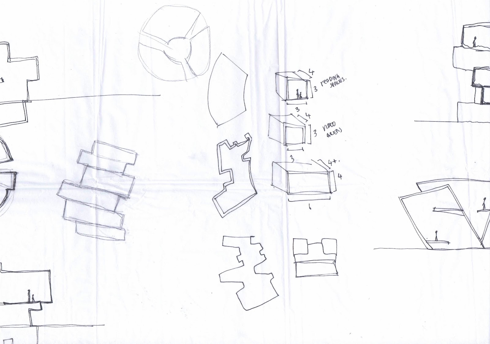
To do this I played with a model to try to figure out
spatial configuration
I was still working with having separate buildings for each
age group and looking at having the idea of levels of chaos for each age group.
Metaphorically speaking having the 6- 10 yo as a very destructed structure, the
10 – 14 year olds as slightly less caotic and the 14 – 18 yo structureto be streamline
and organised.
In the end it was decided that because of the structure the
building would be twisted… creating some interesting spaces between the top
levels buildings for green space opportunity.
The actual structure of the building was as if building
blocks had been pushed and pulled to create a different shape. Within these
pull outs there would be occupiable space . little nooks and crannys for
children to use. Different age
groups would use spaces according to their scale and comfort.There is not
specified space designated for each age group but rather scaling restrictions
which is personal choice for the
child as to whether they occupy the space or not..
*THE FINAL PLAN*
In the final design for the building there are occupiable
spaces at different sizes all around the building. The tighter spaces are
essentially for smaller children or individual study or reflection. The larger
spaces for more social or group activity. On each level there are these types
of spaces but each level itself has specificity in terms of sound levels. The entry level ground level is
encourage for social activity, meaning that this level has a high sound level.
The level below is still a more social setting but has individual areas as well
meaning the sound level would be lower than the ground level. The top level
would be the quiet zone. For learning via reading, and relaxing in the space.
Eacb building has a green space szone in between allowing for louder activity
and a break from the silence within. These spaces also create unique views to parts of the context
of the building.
There is still predominantly internal persuasion with large
window to the interior of the structure towards a focus which is a tree. There
are windows on the exterior of the building but these are mainly for gaining
natural light into the building. This is specifically so for the top level due
to it being a reading space.
I wanted to provide an experience of having many options and
having to explore the building to find your own special spot to learn. .
The spaces are highly flexible in that most do not have
permanent furniture. This is with the exception of the café for parents and
reception and information desks.
There is an area full of bean bags on the base level which children are
able to take anywhere in the building to use as seating for casual reading or
use of laptops. There Is also a laptop hire area so that the devices can be
portable around the whole building.
Typically the scale of circulation space is higher than that
of functional space. Particular parts of the building have special ceilings and
floors to add experience to the space. The main set of stairs are the main circultion other than
elevators between levels and is highlighted by using glass on the outside and a
brightly coloured wall.
The tree in the centre of the building connects all three
levels an the building to the site. It starts from about 1.5 metres below the
ground level with glass between it and the base level. This allows for light
and glimpse of the spaces from the base level up into the courtyard and around
the building. Additionally the shadows of the tree create interesting patterns
on the buildings straight façade. Trees are a common feature of the HSW site
and this tree as well as other surrounding the building connects the stark
exterior with the harsh cliffs and shrubbery.
The clad is light coloured concrete with areas painted
bright colours. It has been identified that colour can be conducive to learning
environments for children. In this
building I have used colours such as blue, green and yellow for the top level,
reds, pinks, purples and yellows for the ground level, and purple, pinks,
yellows and greens for the base level. These colour choices are so to encourage
quieter activities in the upper levels compared to the base level then the most
active happenings in the ground level.
Overall the building acts as a convenient stop for
pedestrians to explore their surrounding via the views allowed in the building.
It isn’t clear the activities within the walls of this building lending it to
be an internalised building. The
journey through the building lets people discover for themselves their own
pathways to their special or favourite spot to learn and take in their
surroundings and this can change as they grow and change.