This week we were required to think of how we would approach the folie to building phase of the unit.
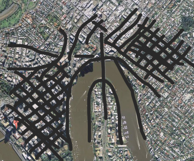
The theme that I selected was library park suggesting that the building would incorporate the features of the park as well as the actual building. For this part of the unit, we have to develop a 500m2 library for ages 6 to 18. We have to transfer certain ideas from our folie into this building as part of the process to develop our very final project in week 15. Our most prominent theme for our folie was "being aware of the river and its constant forces at play". This will be quite difficult I think to put into this building phase, but it would be interesting to see what we can achieve with it. Perhaps bringing this down to 'water' or the 'river' would help. The library has to be a learning centre, and something different from a typical library atmosphere. It has to encourage children to be drawn to it and to learn.
At this point I am trying to brainstorm different ideas about libraries and also research modern libraries and learning centres and seeing their approach to learning activities and experiences.
Brainstorming:
Libraries:
- as a learning centre
- as a community hub
- as an inviting space (to counteract the derelict and secluded site)
- as a place with resources for learning such as books, activities, technology
Technologies could be:
- Computers
- Sound rooms
- Video rooms
- Projection screens
What interests and applies to young people:
- This will require some research but as a basis this is what I have experienced from having younger sisters.
- Young children around ages 6 - 10 : picture books, computer games (simple), drawing, painting, building blocks, toys. Cushions, playgrounds, areas to hide and invesigate.
- Children around 11 to 14: A mix of computer and social activities, fiction novels and books, sound booths (music), computer games.
- Children aged 15 to 18: Novels fiction and non fiction , high school grade educational books, computers, socialising, research facilities, lounging areas, social areas.
How to entice people into the space:
- Make the entry open and public
- make the entry not overwhelming
- Perhaps lead them into the building by offering views or people using the space.
Architectural Qualities:
- Natural Lighting
- Perhaps dappled lighting in some areas like in the folie.
- Ambience in 'chill out' areas
- Obvious breaks between groups/ levels between age groups.
- Framing views from site
- Sound will be loud in younger childrens areas versus quiet in older areas
- I think green space is important or at least views into green spaces.
- A combination of private and public spaces for a range of amounts of people.
- I think vibrant colours are needed for some areas perhaps juxtaposed with raw materials that have site context and relation to our folie.
- Transitory spaces perhaps reflect water or river.
- Scale? Long and linear and short or Tall and vertical .
What kinds of spaces are needed:
- Amenities
- Lobby/ information desk
- Storage spaces
- Electrical room for facilities
- Play interactive learning space (informal) aimed for 6- 8 yo (CDC child development.com)
- A quieter learning space (informal) aimed for 6 - 8 yo
- A small coffee shop for parents
- An interactive more technological space and more books (informal aimed for 9 - 12 yo
- A quiter space (formal) aimed for 9 - 12 yo
- A referencing space (formal) aimed for 13 - 18 yo
- Techno space (informal) aime for 13 - 18 yo
- A lounging area (informal) for communications aimed for 13 - 18 yo.
- Green space for lounging, playing and learning (informal) aimed for all ages.
All of the above spaces will need a combination of access to facilities, outdoor views or natural lighting, working surfaces and seating arrangements (multi use and changeable).
I think that this will be a library where things cannot be borrowed out but it is a place where referencing can be done. Photos can be taken and own books can be bought in.
Ideas from Folie:
- transitional space
- raw materials (wood, stone, brushed steel)
- water
- river
- shell
- dappled lighting
- shadows
- open but enclosed space
- mystery
- sounds
- bridge structure shapes
Exemplars:
Rolex Learning Centre - Switzerland
Built by SANAA. I was drawn to this building because of its form. It is made out of concrete and has a continuous length of flooring throughout it.
Information accessed from :
http://www.archdaily.com/50235/rolex-learning-center-sanaa/
 |
| Organic Structure |
 |
| Smooth continuous carpet and ceiling. |
Vennesla Library and Culture House - Vennesla
By Helen and Hard architects. The architects of this library aimed to connect the old community centre with the new library. The ribs provide structural support, technical infrastructure and functionality. It is classified as an "a" grade energy use building. What I find most impressive about this library is its combination of structure, technical support and functionality in one simple form. Additionally I like the way that the ribs make areas secluded so as a person can concentrate on their own and have their own study space. Also I like the lighting of the building. It combines natural lighting with soft artificial lighting that is more of a glow.
Information accessed from :
http://www.archdaily.com/209340/vennesla-library-and-culture-house-helen-hard/
 |
| Childrens books |
 |
| Front Facade |
 |
| Rear view of library coming out from the back of the community centre. |
 |
| Elegantly uses scale to fit in with the contextual buildings |
 |
| Ground floor |
 |
| Mezzanine level |
The New York Public Library - New York
Built by 1100 Architects. This library occupies the bottom two floors of a high rise residential building. The layout is open and easy to navigate and has colour and visual cues to help navigate the space. The central staircase is celebrated rather than hidden. It is highly environmentally friendly building. Both natural light and artificial light is needed in this library and the artificial lights compensate and change dimness depending on the amount of sunlight coming through the windows.
Information accessed from:
http://www.archdaily.com/205410/the-new-york-public-library-1100-architect/
 |
| Obvious library exterior to encourage patrons into the building. |
 |
| Mezzanine Floor Plan |
Picture Book Museum - Iwaki City
Designed by Tadao Ando in 2005. This museum or library has a predominately concrete look, perhaps quite harsh on the outside with straight edges and no curves. But it is on the inside that the 'magic' happens. Ando has managed to juxtapose the use of concrete with the use of wood, which makes the building have cold spaces and then warm spaces. Needless to say the warm wooden spaces are where the actual picture book library is. The colours of the outside of the books provide the only bright colour other than wood in the space and yet this makes the space very vibrant. A child would be drawn to this and the miraculous display of picture books - face out - would encourage them to explore and investigate more books. There is also what appears to be a coffee shop or area for the parents of the children. Ando is well known for his use of concrete, and believes that concrete can be rich in colour and that its variances in colour add depth to a surface. Additionally this building is full of light. Like many of andos other buildings he utilises natural lighting even in very deep interior spaces. The stairs through the main gallery offer not only a way of getting around but also a place for the children to sit and read their books. The museum even has a cat on the premises for the children to play with. I really enjoy this building and I think the materiality of it would go well with the site for this project.
Information accessed from :
http://libraryarchitecture.wikispaces.com/Picture+Book+Museum,+Iwaki+City,+Fukushima+Prefecture,+Japan+(building)
http://en.wikipedia.org/wiki/Picture_Book_Museum,_Iwaki_City#cite_note-3
 |
| Exterior and entry view of the museum. |
 |
| Views into the picture book area. It is almost like a surprise to see whats inside so bright compared to exterior render.. |
 |
| Even the toilets have interesting features. The bright colours reflect that of picture books and also works to juxtapose the concrete structure of the building. |

 |
| The museum in use. The children can sit on the stairs. |
 |
| Natural lighting outside |
 |
inside the picture book museum
|
Ecological Children Activity and Education Centre - Koh Kood, Thailand
Built by 24hr Architecture in 2009. This centre is based on a manta-ray design. It is essentially a playground but it also has learning activities and resources such as books and pens and paper. The design is alot like a tree house with its bamboo structure and spaces all around the structure. There is also a slide. It has a media room, library, art room, music room, fashion room and chill balcony.
Information accessed from:
http://www.arthitectural.com/24h-architecture-ecological-children-activity-and-education-center/
Dalian Public Library
I like the way this library uses a courtyard and a circular plan to incorporate nature into it. According to Architecture Collective, it is a centre built in a park area that aims to be the centre of the community. Its form takes on the shape of a rose petal because the Dalian town flower is the monthly rose. Images and Information accessed from :
http://www.architectscollective.net/projects/all/38/
http://www.archdaily.com/193890/dalian-public-library-architects-collective/
 |
| Diagrams showing how the library works, its views. |
 |
| Ground Floor |
 |
| First Floor |
 |
| Site Plan |
 |
| Interior render |
BIG or Bjarke Ingels Group:
Are a group of architects who use diagrams to design and communicate their buildings.
All following information accessed from:
http://www.big.dk
Vilhelmsro Primary School - by BIG
This schools curriculum will be sustainability and nature. So the design of the school will reflect this. The landscape it sits on is an undulating hillside and the building takes advantage of this through views outwards. The classrooms are designed in a way that allows natural light into every room.
 |
| Diagrams about building |
 |
| Ceiling designed in a way to allow light into every room |
 |
| Green Roof so provide collection of water, and thermal mass |
 |
| Lots of green space |
Anstana National Library - by BIG
The competition for this project was to make a library that was also a community centre and a gallery. The architects have used diagrams to show the functionality of the space. I really like the form of this one and its interesting to see how it works as a structure.
 |
| Diagramming of function and form |
Musee national des beaux-arts du Quebec - by BIG
I really like the form of this project. It is quite a simple design but I think it is really effective.
 |
| Diagrams of form resolution |
 |
| Section |
Utrechy Library and Housing -by BIG
This building is a library which leads up to a housing complex in the upper levels. I like this one because of its exterior and its conjunction between public and private spaces.
 |
| Diagramming levels with different functions and purposes. |